Race Strategy
Load any endurance session — a race, a long practice run, anything over 30 minutes or with a pit stop — and the Race Strategy tab turns it into a race engineer's briefing: how far your fuel really goes, how long your tyres really last, what your realistic pace is once traffic and mistakes are counted, and where your next pit stop should land. This page walks through every widget: what it shows, what it means, and what to do with it.
1. The basics — and making the layout yours
The Race Strategy tab appears automatically whenever the session you load qualifies as endurance running. Everything on it is computed from your own telemetry — nothing is guessed, and nothing is a prediction about your next race. It describes what actually happened in this session, so you can plan the next one on facts.
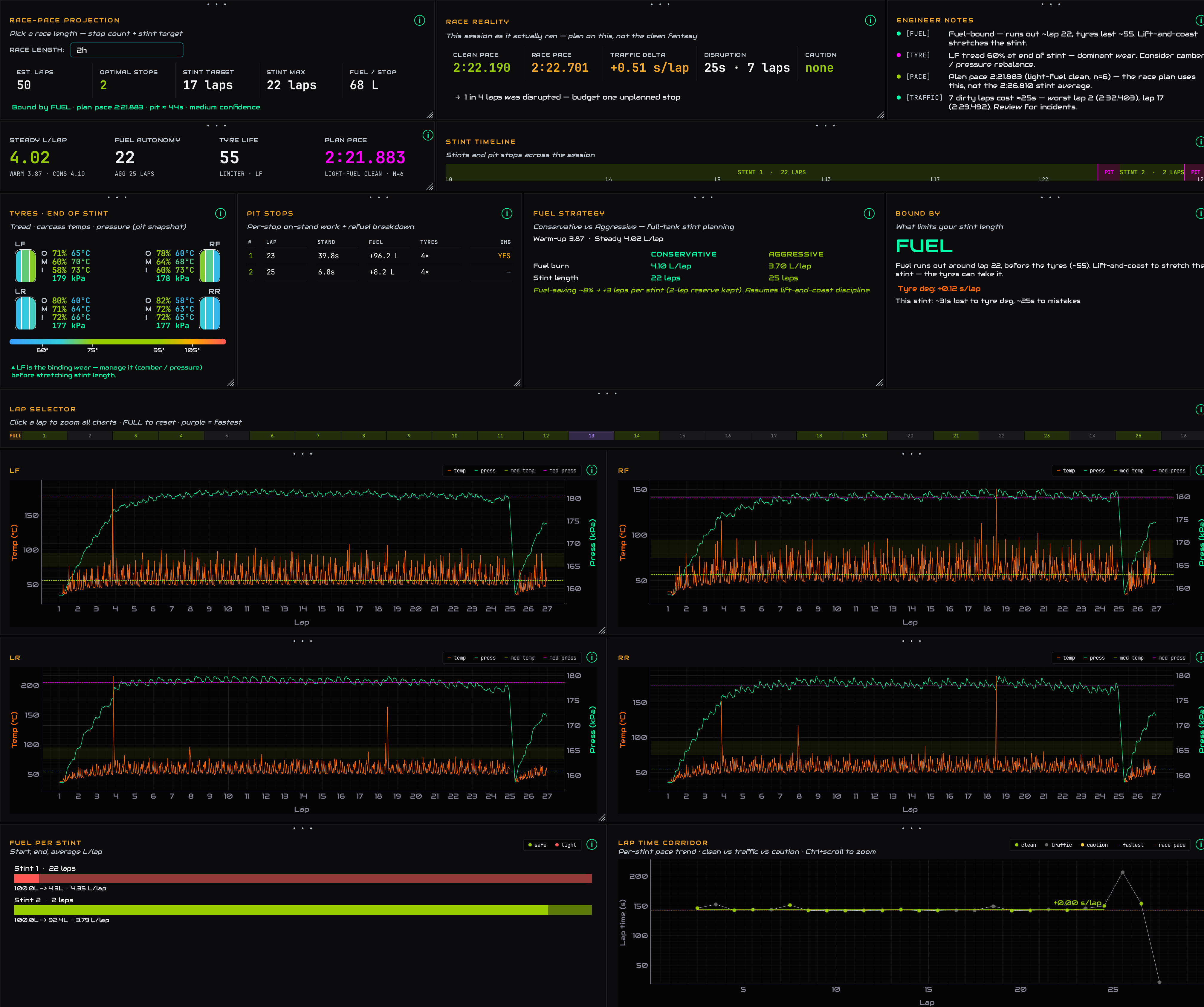
The full Race Strategy tab — decisions at the top, evidence charts below
Every panel is yours to arrange. Drag the • • • strip at the top of any panel to move it, drag the bottom-right corner to resize it, and click a panel to bring it to the front. Your arrangement saves automatically and comes back next time you open the app. If you ever want the original arrangement back, press ⤺ Reset layout in the top-right of the summary strip.
2. The summary strip

Session length · laps · stints · what limits you · your safety margin
The one-line health check: how long the session ran, total laps, how many stints you did, and — the important one — BINDING: whether FUEL or TYRES is the thing that ends your stint first. On the right, TYRE / FUEL MARGIN shows how many laps of headroom sit between the two. A big margin means one of them is nowhere near a problem; a small one means both run out around the same lap and your pit window is tight.
3. Race-Pace Projection
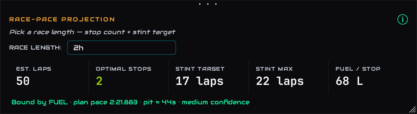
Pick a race length — get stops, stint target and fuel per stop
This is the stint planner. Pick the race length you're preparing for (2h, 4h, 6h…) and it projects your session data across that distance:
- EST. LAPS — how many laps that race is for you, at your pace, pit time included.
- OPTIMAL STOPS — how many pit stops the race needs.
- STINT TARGET — the even-split stint length to aim for.
- STINT MAX — the hard ceiling per stint, set by whatever binds you (fuel or tyres).
- FUEL / STOP — roughly how much to take on at each stop.
The line underneath tells you what the plan is built on: the binding constraint, the pace used, the average pit loss, and a confidence tag. Low confidence just means a short session — drive more laps and the plan firms up.
4. Race Reality
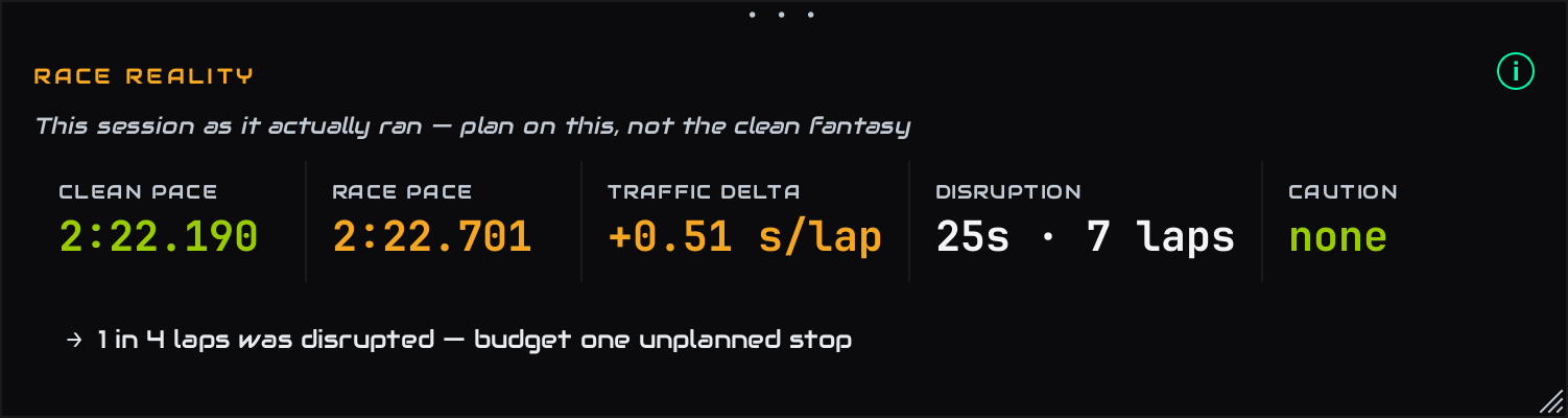
The session as it actually ran — plan on this, not the clean fantasy
Most tools plan your race on your best clean laps. Real races have traffic, small mistakes and cautions — so this panel shows both numbers side by side:
- CLEAN PACE — your typical clean lap. The optimistic number.
- RACE PACE — your typical lap across everything green-flag, traffic and scrappy laps included. The realistic number a race plan should use.
- TRAFFIC DELTA — the gap between the two, per lap. This is what dicing with other cars actually costs you.
- DISRUPTION — the total time your non-clean laps cost this session, and how many laps were affected.
- CAUTION — how many full-course yellows the session had, and how long they lasted.
The arrow line underneath turns all of that into one concrete suggestion — for example carrying a little extra fuel as disruption margin, or budgeting for one unplanned stop if a quarter of your laps were getting interrupted.
5. Key numbers

Fuel burn · fuel autonomy · tyre life · plan pace
- STEADY L/LAP — your settled fuel burn per lap once tyres and brain are up to temperature (the small print shows the warm-up figure next to it).
- FUEL AUTONOMY — how many laps a full tank gives you at that burn.
- TYRE LIFE — how many laps a fresh set lasts before it's properly gone, and which corner of the car gives out first (the "limiter").
- PLAN PACE — your light-fuel, clear-track lap time: the pace the race plan projects with, not your average. It's deliberately quicker than Race Reality's CLEAN PACE, which is the median of all your clean laps, heavy fuel included.
6. Stint Timeline

Your session at a glance — stints, pit visits, lap scale
The whole session on one line: green blocks are stints (with lap counts), pink slivers are pit visits, and the scale underneath maps it to lap numbers. If the session had cautions, a thin yellow band appears under the strip showing exactly when the track was under yellow.
7. Tyres · End of Stint
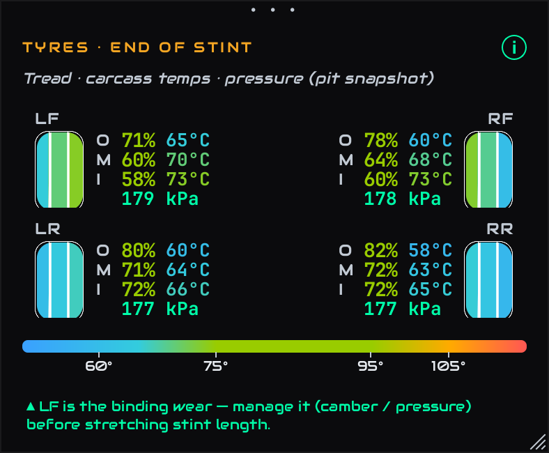
Tread, carcass temps and pressure per tyre — laid out like the car
A pit-stop snapshot of all four tyres at the end of your longest stint, laid out like the car (left tyres on the left, graphics on the outside). For each tyre:
- The tyre graphic is coloured by temperature across its three zones — Outer, Middle, Inner — using the colour scale at the bottom of the panel. Green is the healthy window; blue is cold, amber-to-red is overheating.
- The percentages are tread remaining per zone. Green is plenty, amber is worn, red means that zone is finished.
- The pressure underneath is that tyre's average running pressure for the stint.
What to look for: one zone wearing much faster than the others. Inner-edge wear with high inner temps usually means too much camber (or too little pressure); a hot, worn middle points to over-inflation. The note at the bottom names the tyre that limits your stint length — fix that one first before trying to stretch stints.
8. Pit Stops
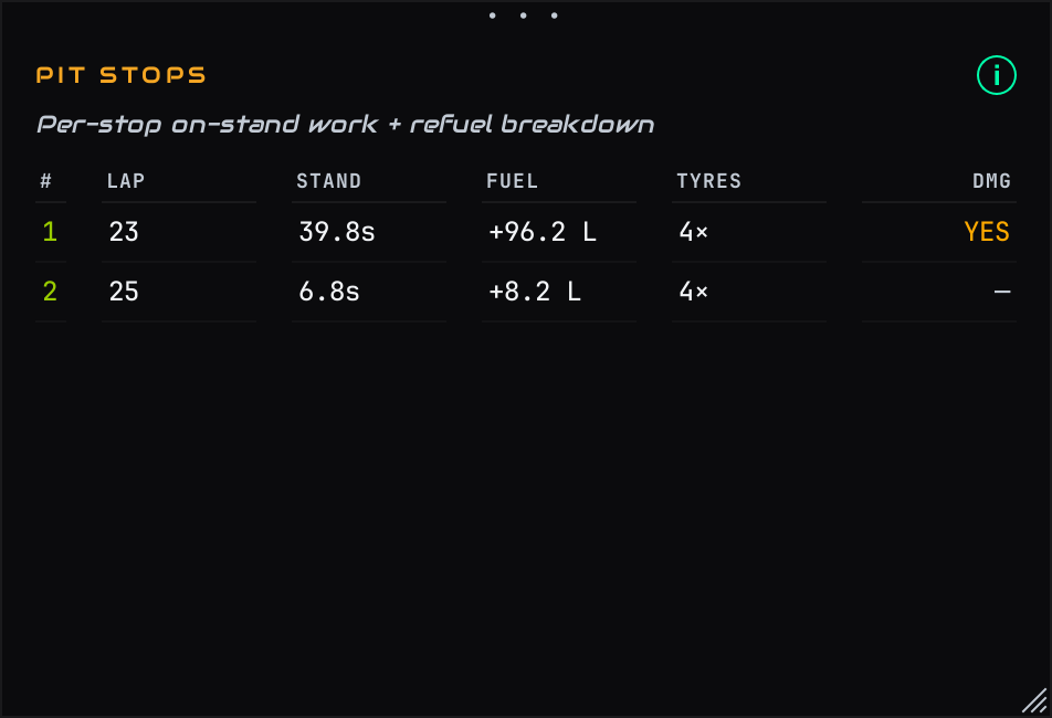
Every stop: lap, time stationary, fuel added, tyres, damage
One row per pit visit: the lap you stopped, how long you were stationary (STAND), how much fuel went in, how many tyres were changed, and whether the stop included damage repair (DMG). Use it to sanity-check your pit work — a stand time much longer than your fuel fill needs means time was lost to tyres, repairs, or fumbling the pit limiter.
9. Fuel Strategy
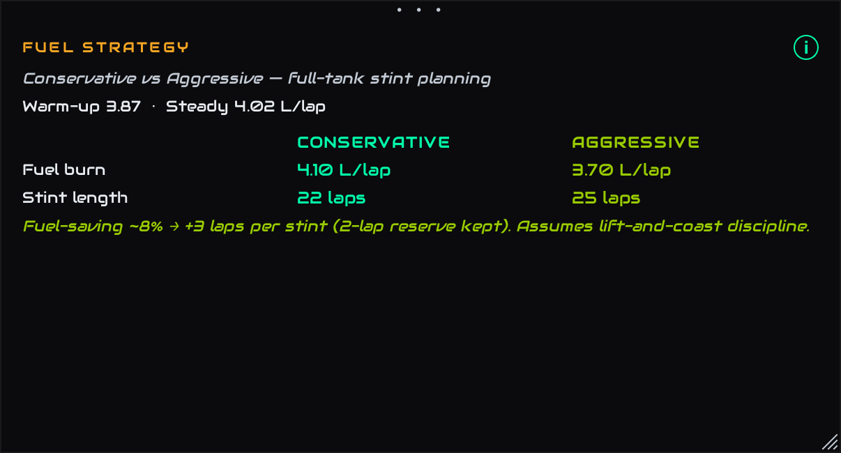
Conservative vs Aggressive — two ways to run a full tank
Two full-tank plans built from your real burn:
- CONSERVATIVE — your measured steady burn, with a safety reserve. The stint length you can bank on.
- AGGRESSIVE — the burn you'd need if you drive with fuel-saving discipline (lift-and-coast into the heavy braking zones), and the extra laps it buys per stint.
The green line spells out the trade: roughly 8% saved is about +3 laps per stint. Over a long race, one saved stop can be worth more than pushing flat out — that's a decision this panel lets you make with numbers instead of hope.
10. Bound By
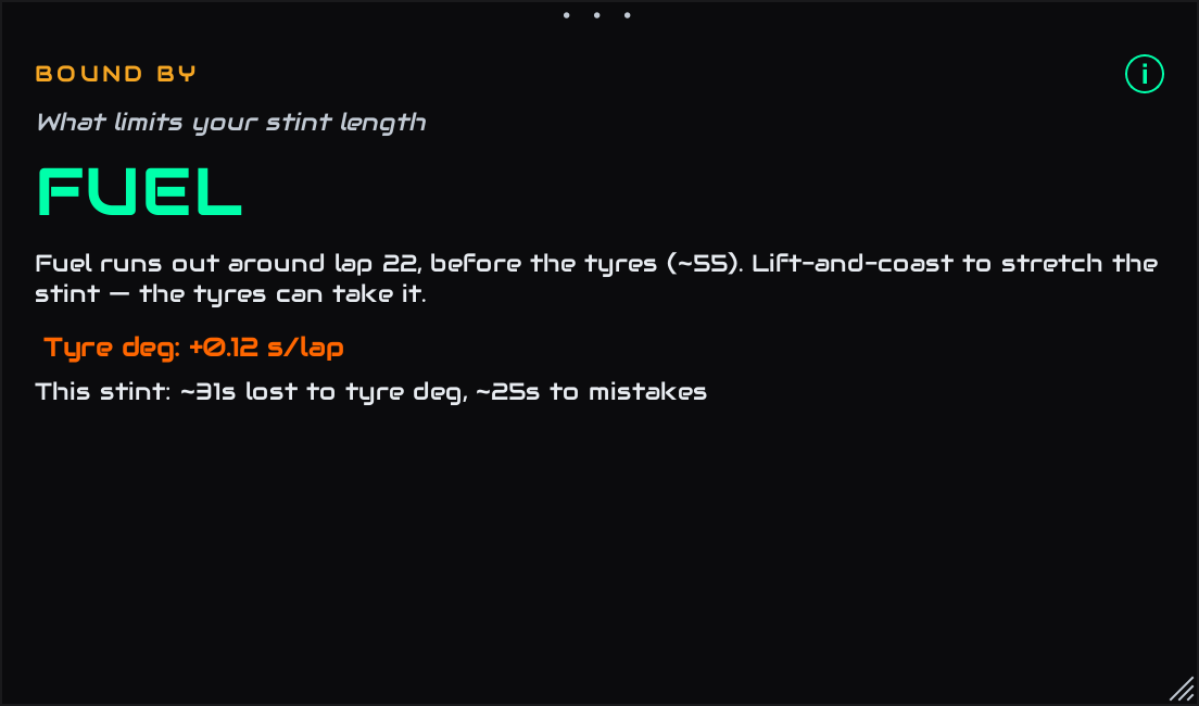
The one word that shapes your whole race: FUEL or TYRES
The strategy verdict. FUEL means the tank runs dry before the tyres give up — so fuel-saving stretches your stint, and your tyres can take the extra laps. TYRES means the rubber is gone before the fuel — so pit when the tyres say so, and there's no point saving fuel. Underneath, tyre deg shows how much lap time the tyres cost you per lap as they age, and how much of this stint's time went to tyre wear versus your own mistakes — an honest split between what the car did and what you did.
11. Engineer Notes
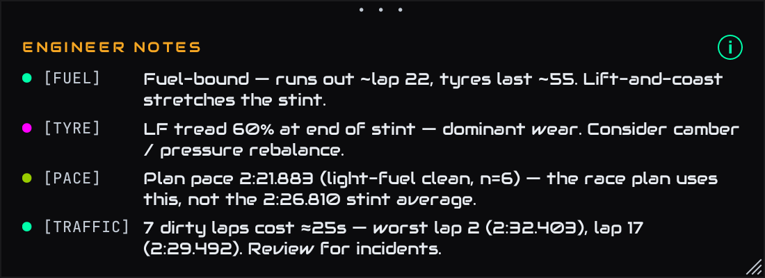
The briefing, in plain English
Everything above, summarised the way a race engineer would say it over the radio: what binds you, which tyre to worry about, which pace number to plan with, and what traffic cost you. Tags on the left (FUEL TYRE PACE) tell you which department each note comes from. If you read only one panel after a session, read this one.
12. Lap Selector

Click any lap to zoom every chart to it — FULL resets
A clickable strip of your laps. Click one and every chart on the tab zooms to that lap; click FULL to see the whole session again. The colours tell you what each lap was: clean traffic / pit caution fastest. Hover any lap for its exact time.
13. Tyre temperature & pressure charts
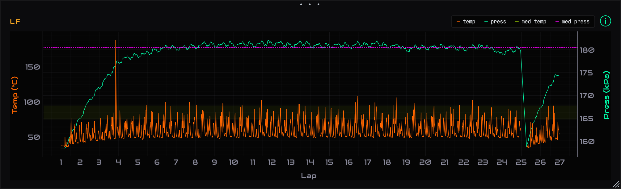
One chart per tyre — temperature (orange) and pressure (green trace, right scale)
Four charts, one per corner of the car, laid out like the car. Each shows that tyre's whole session: temperature against the left scale and pressure against the right. The dashed lines are that tyre's typical (median) levels, and the soft green band is the healthy temperature window — roughly 75–95°C for a GT tyre.
- Temps living inside the band = the tyre is working where it's happiest.
- A tyre consistently hotter than its three siblings = it's doing too much work — setup balance, pressure, or your driving is leaning on it.
- Pressure creeping up over a stint is normal (hot air expands); big differences between tyres are worth fixing with cold-pressure changes.
- Hover any chart and a crosshair appears on all four at once, with exact values — and the same crosshair follows on the fuel and lap-time charts, so you can line events up in time.
Questions?
The live side of race day — fuel calls, live tyres and the pit-rejoin picture while you drive — lives in the Live Pit Wall guide. The rest of the app is covered in the main user guide. If something on the Race Strategy tab doesn't look right with your data, use the feedback button in the app — real session files are how this tab gets smarter.